THE SOLUTION
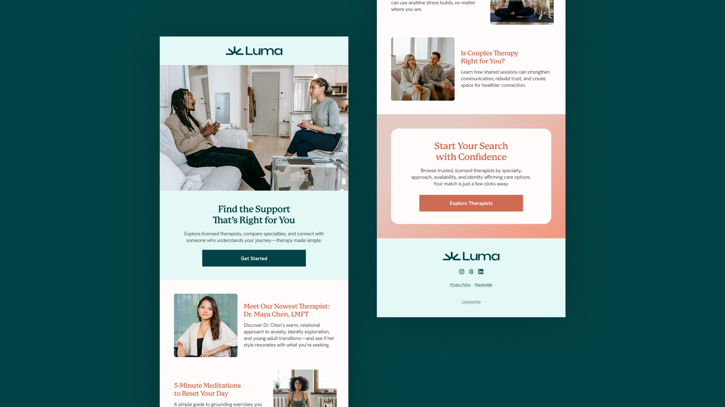
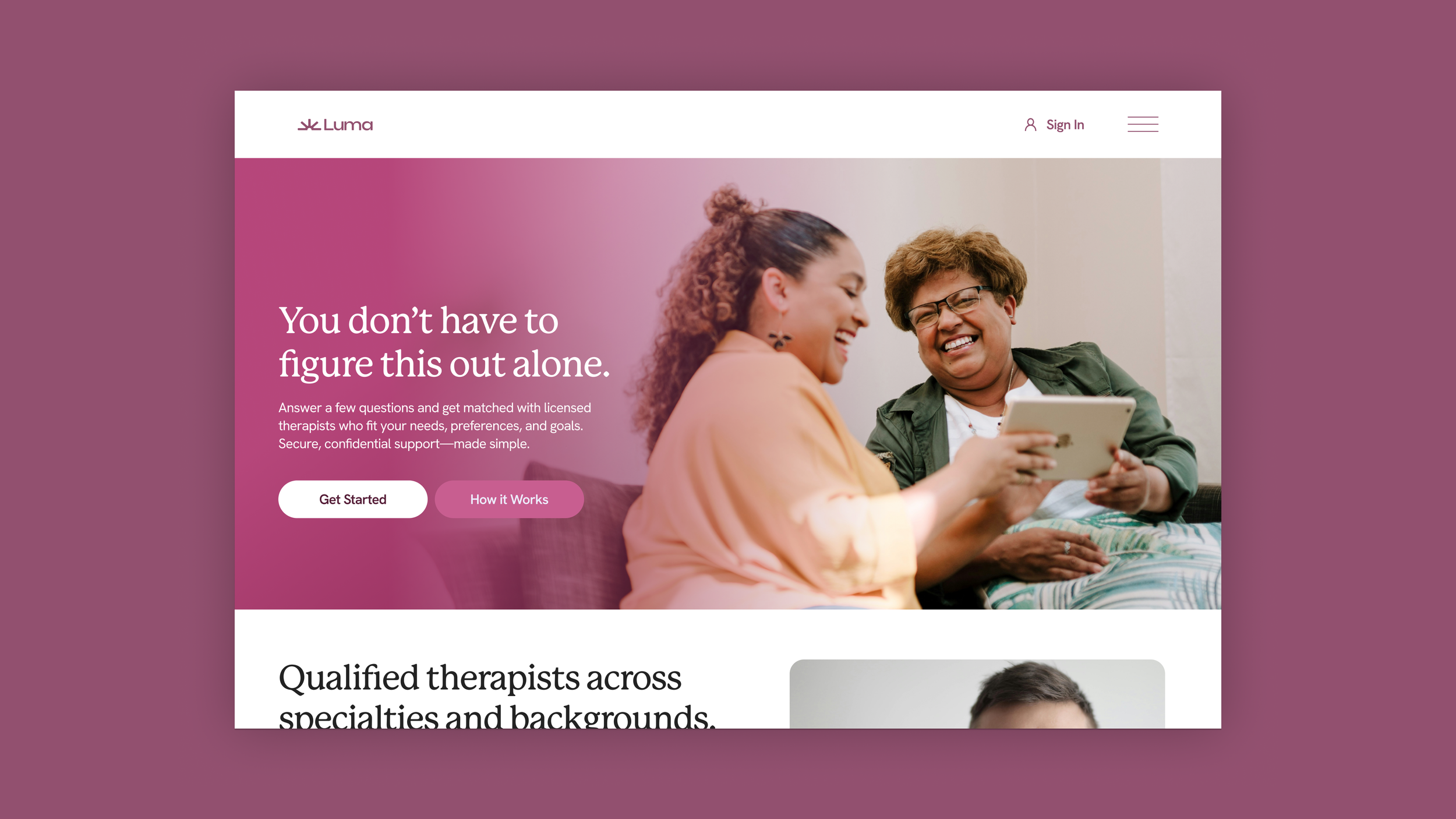
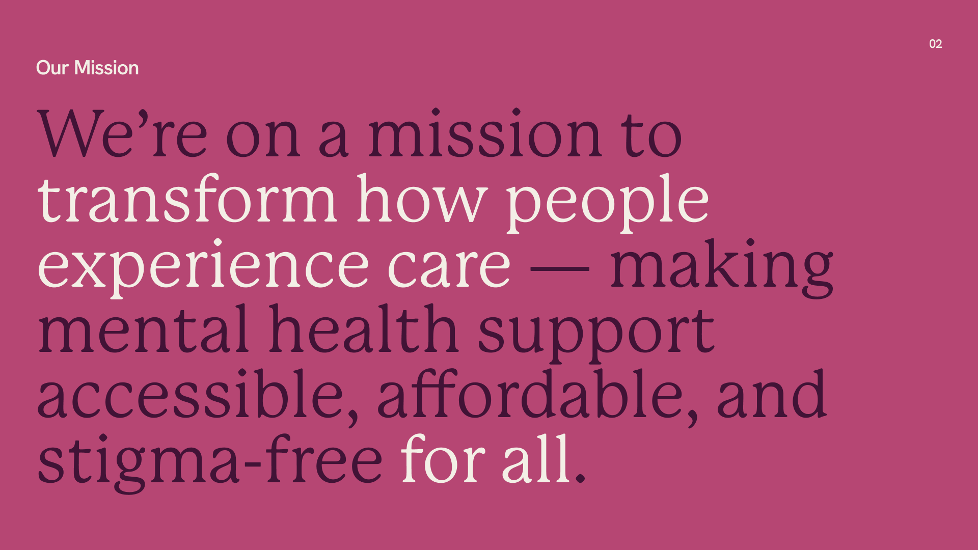
The visual identity embodies trust, approachability, and expertise through a slab serif typeface that conveys stability and professionalism while remaining welcoming. A warm color palette—soft oranges, muted pinks, and gentle neutrals—evokes comfort, optimism, and a sense of safety. Photography highlights a diverse patient base, emphasizing inclusivity, real-world connection, and the positive impact of therapy. Together, these elements form a cohesive brand system that reassures users, reflects Luma’s mission, and positions the platform as both caring and credible.


